Lesson Objective
- Develop an understanding of the use of HTML.
- Understand how CSS is used to style web pages.
- Be able to recognise and use a variety of HTML and CSS tags.
KS3, GCSE, A-Level Computing Resources
HTML is the standard markup language for creating Web pages. It's not a programming language, but rather a markup language that tells web browsers how to display content like text, images, and videos. You can view the HTML of any web page by pressing Ctrl + U.
Web pages are made up of a Head and Body
Paragraph tags help to define new blocks of content. <p> tags create a new line for new content within them and leave a small gap between paragraphs.
<!DOCTYPE html>
<html>
<head>
<title>Page Title</title>
</head>
<body>

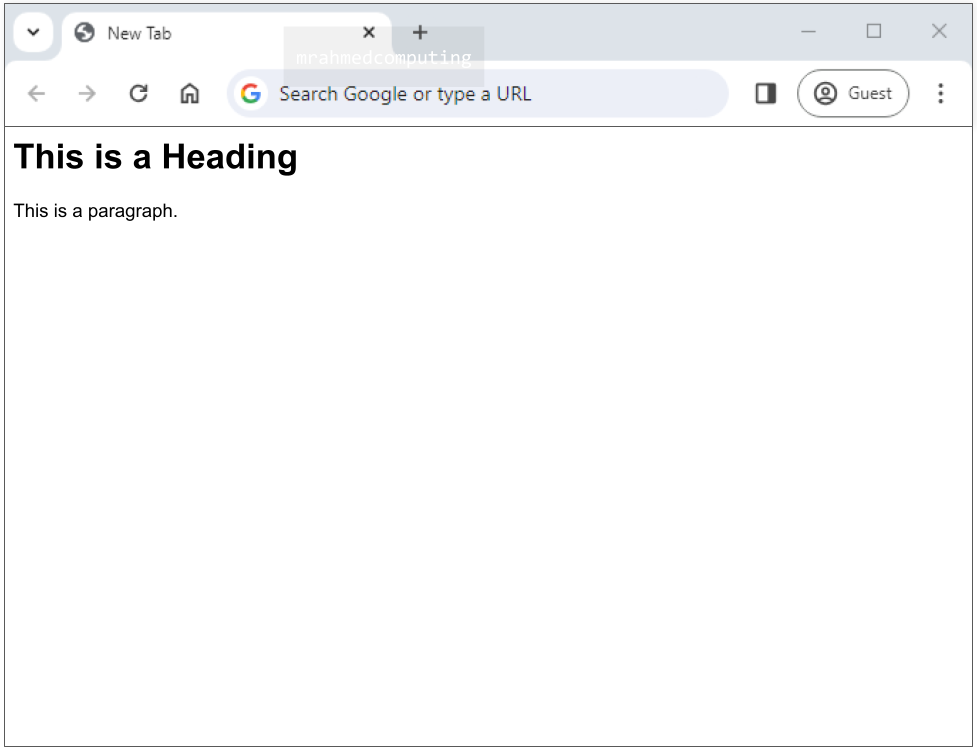
<h1>This is a Heading</h1>
<p>This is a paragraph.</p>

</body>
</html>
The HTML <img> tag is used to embed an image in a web page.
The <img> tag can have two attributes:
<!DOCTYPE html>
<html>
<head>
<title>Page Title</title>
</head>
<body>

<h1>This is a Heading</h1>
<p>This is a paragraph.</p>
<img src="bus_driver.jpg" alt="a person the drives a bus">

</body>
</html>

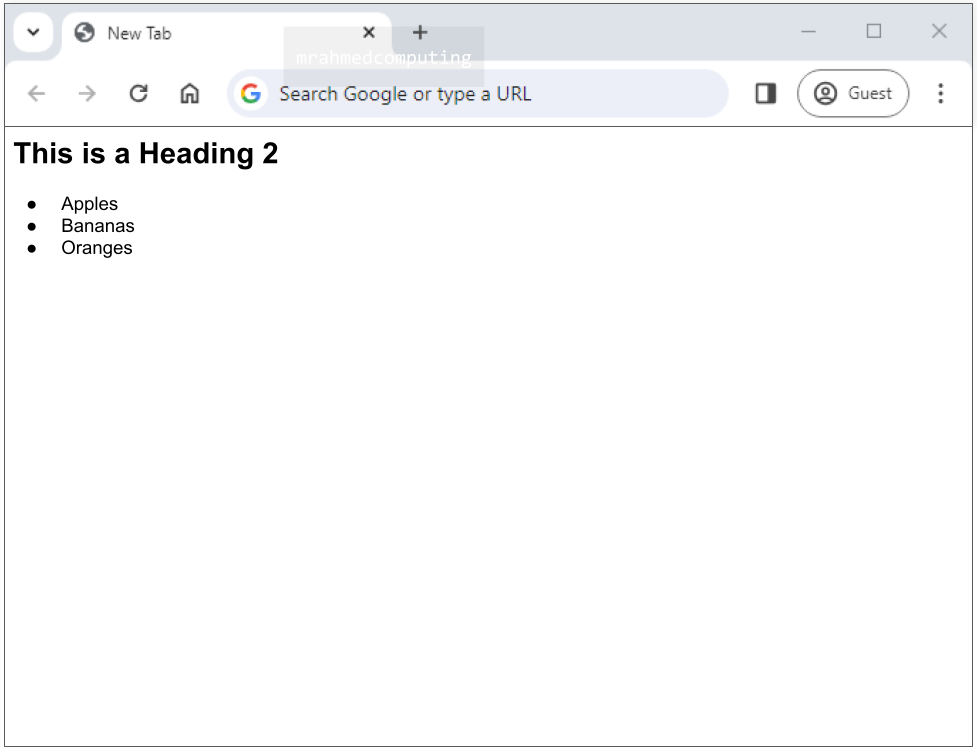
An unordered list starts with the <ul> tag. Each list item starts with the <li> tag.
The list items will be marked with bullets (small black circles) by default.
<!DOCTYPE html>
<html>
<head>
<title>Page Title</title>
</head>
<body>

<h2>This is a Heading 2 tag</h2>
<ul>
  <li>Apples</li>
  <li>Bananas</li>
  <li>Oranges</li>
</ul>

</body>
</html>
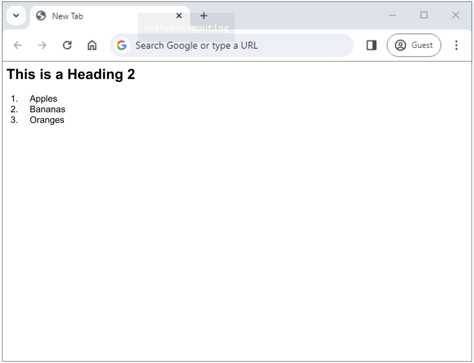
An ordered list starts with the <ol> tag. Each list item starts with the <li> tag.
The list items will be marked with numbers by default.
<!DOCTYPE html>
<html>
<head>
<title>Page Title</title>
</head>
<body>

<h2>This is a Heading 2 tag</h2>
<ol>
  <li>Apples</li>
  <li>Bananas</li>
  <li>Oranges</li>
</ol>

</body>
</html>
CSS stands for Cascading Style Sheets and it's a language used to style web pages. It's the companion language to HTML, which is used to structure the content of a web page. CSS tells the browser how to display the HTML elements on the screen, such as the font, color, background, and layout.
CSS saves a lot of work. It can control the layout of multiple web pages all at once.
External stylesheets are stored in CSS files.

An internal style sheet may be used if one single HTML page has a unique style.
The internal style is defined inside the <style> element, inside the head section.
<!DOCTYPE html>
<html>
<head>
<title>Page Title</title>
<style>
body {background-color: lightpurple;}
h1 {
  color: black;
  margin-left: 20px;
}
</style>
</head>
<body>
<h1>Welcome to my website</h1>

</body>
</html>

With an external style sheet, you can change the look of an entire website by changing just one file!
Each HTML page must include a reference to the external style sheet file inside the <link> element, inside the head section.
<!DOCTYPE html>
<html>
<head>
<link rel="stylesheet" href="style.css">
</head>
<body>
<h1>Welcome to my website</h1>

</body>
</html>
body {background-color: #EFAB9D;}
h1 {
  color: #6E9DFF;
  margin-left: 20px;
}

In CSS, the "box model" helps you control layout and design.
The CSS box model defines the structure of each HTML element on a page, with four key components: content, padding, borders, and margins.
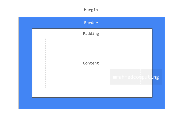
Explanation of the different parts:
Content - The content of the box, where text and images appear.
Padding - Clears an area around the content. The padding is transparent.

Border - A border that goes around the padding and content.
Margin - Clears an area outside the border. The margin is transparent.

Note:
The box model allows us to add a border around elements, and to define space between elements.
The <div> element is by default a block element, meaning that it takes all available width, and comes with line breaks before and after.
The <div> element is often used to group sections of a web page together.
Creating a <div> block for the entire webpage provides a method of formatting everything behind the content.
On its own, it does nothing but group HTML.
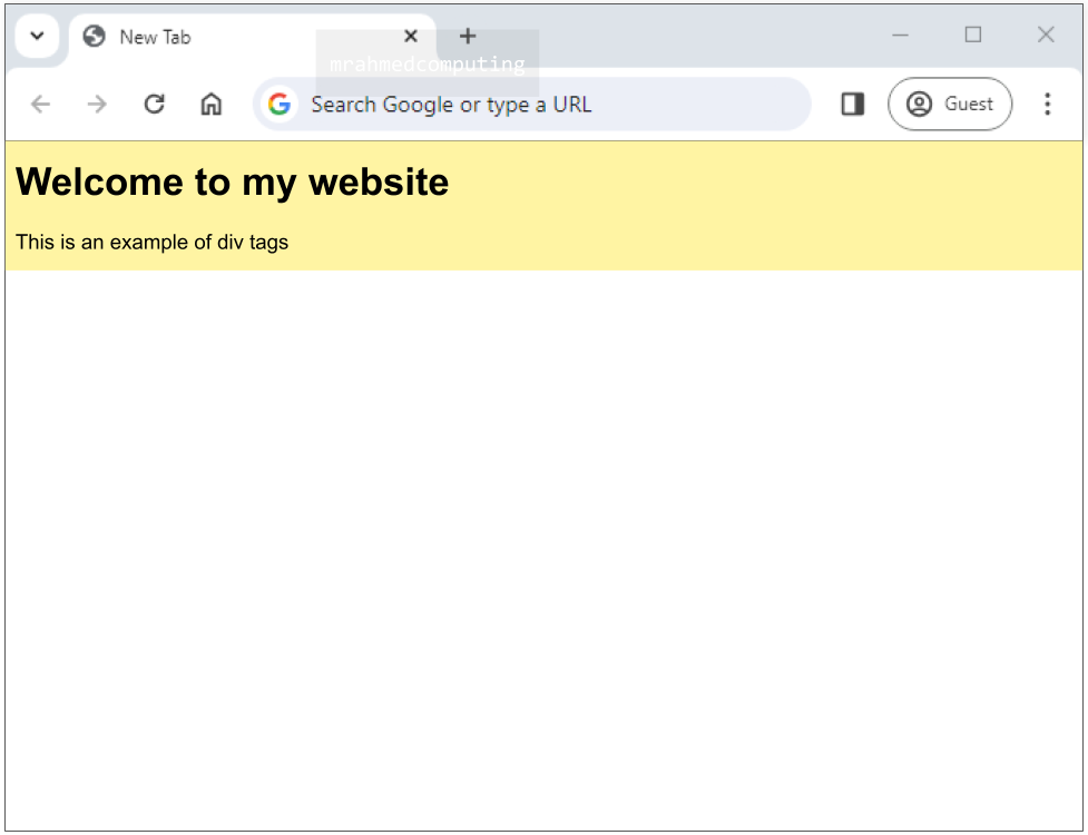
<!DOCTYPE html>
<html>
<head>
<style>
div {background-color: #FFF4A3;}
</style>
</head>
<body>

<div>
<h1>Welcome to my website</h1>
<p>This is an example of div tags</p>
</div>

</body>
</html>
Classes are used to target groups of elements for styling or other purposes, where as identifiers are used target a specific, unique element.
If multiple <div> blocks on a page were to be given the same styles, a class could be set up to apply the styles globally.
/*Style the element with the id "Header" */
#Header {
  background-color: lightblue;
  color: black;
  padding: 40px;
  text-align: center;
}

/* Style all elements with the class name "fruit" */
.fruit {
  background-color: tomato;
  color: white;
  padding: 10px;
}
<!DOCTYPE html>
<html>
<head>
<link rel="stylesheet" href="style.css">
</head>
<body>
/*An element with a unique id*/
<h1 id="Header">Fruits I Like...</h1>
/*Multiple elements with same class*/
<h2 class="fruit">Apple</h2>
<p>Apples are green.</p>
<h2 class="fruit">Pineapple</h2>
<p>Pineapples are long-ish.</p>
<h2 class="fruit">Mango</h2>
<p>Mangos are sweet.</p>
</body>
</html>
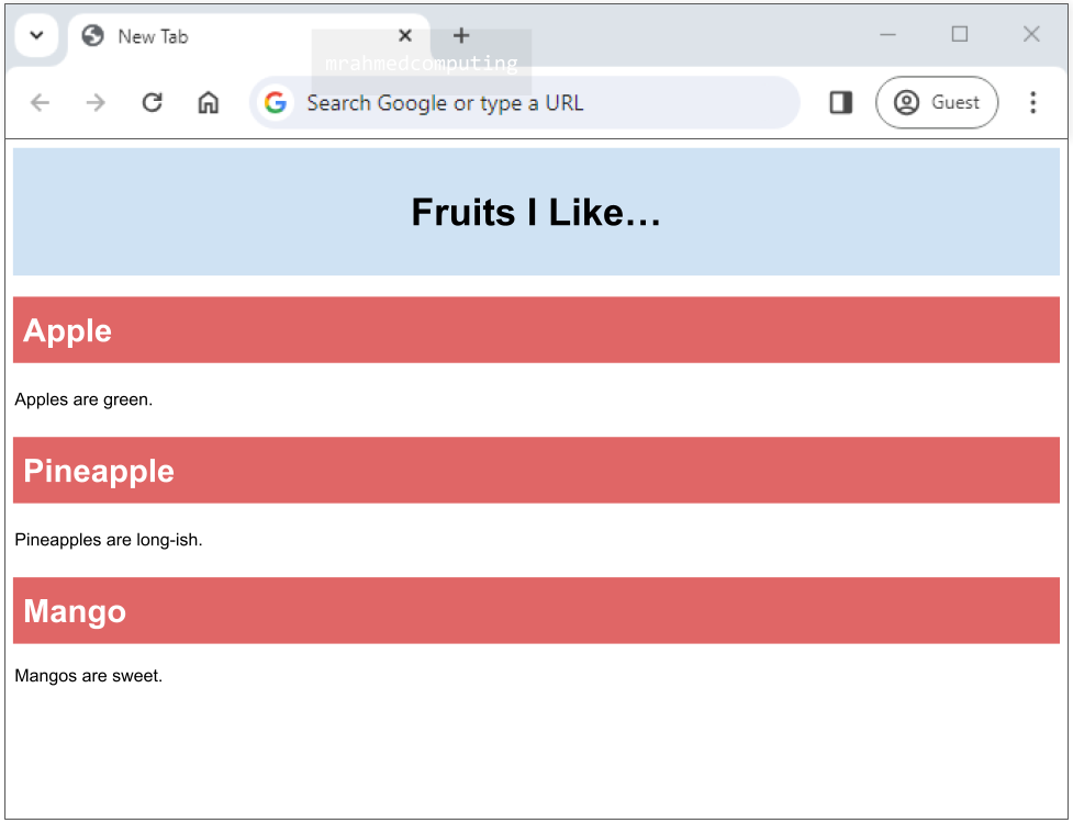
Note: In HTML, a class name can be shared by multiple elements on a page, whereas an ID name must be unique and used only by a single HTML element.
Extra Note: Names are case sensitive. For example, “myVariable” and “myvariable” are considered different names. Names must contain at least one character. They cannot start with a number and cannot contain whitespaces e.g. spaces or tabs.
Media queries in CSS3 extended the CSS2 media types idea: Instead of looking for a type of device, they look at the capability of the device.
Media queries can be used to check many things, such as:
Using media queries are a popular technique for delivering a tailored style sheet to desktops, laptops, tablets, and mobile phones (such as iPhone and Android phones).
The media query will only apply if the media type is screen and the viewport is 480px wide or wider.
When the browser is reduced to a size below 480px it will change the background colour to pink.
More information on w3schools CSS Media Queries - Link
The example image below shows that, when the width of the screen goes below 480px the background colour changes to a light-ish pink colour. Otherwise the background is a light blue colour.
<!DOCTYPE html>
<html>
<head>
<style>

body {background-color: pink;}
@media screen and (min-width: 480px) {
body {background-color: lightblue;}
}

</style>
</head>
<body>
<p>What is happening...</p>
</body>
</html>

Before the Flexbox Layout module, there were four layout modes:
The CSS Flexbox Layout Module was introduced to make it easier to design flexible responsive layout structure without using float or positioning attributes.
A Flexible Layout must have a parent element with the display property set to flex.
Direct child elements(s) of the flexible container automatically becomes flexible items.
The image below shows an example of a flexbox layout used with a media query to re orientate and change the layout of the screen when the width of the screen is reduced. Mobile phone size. Please also note that the images does not accurately represent the code example above.
<!DOCTYPE html>
<html>
<head>
<link rel="stylesheet" href="style.css">
</head>
<body>

<div class = "row">
<div class = "content">
<h1>Left Section</h1></div>
<div class = "content">
<p>Right Section</p></div>
</div>

</body>
</html>
/* Column container */
.row {
display: flex;
flex-wrap: wrap;
}
.content{
background-color: #fff;
flex: 50%;
height: fit-content;
}

@media screen and (max-width: 700px) {
  .row {
    flex-direction: column;
  }
}
Note: To make the CSS flex method work, surround the <div> elements with another <div> element and give it the status as a flex container.
